Colour trends in 2022: Pantone, Sadolin and Tikkurila


If you look at the latest colour recommendations from paint manufacturers and trend setters, they all seem to have teamed up and turned a dreamy gaze to the skies. The colour trends in 2022 are mostly various shades of blue, but there are other exciting surprises.
Pantone’s periwinkle Very Peri is the shade the sky turns after sunset before the night spreads its mysterious veil over everything. Also a few years earlier, in 2020, Pantone chose its trend recommendation from among shades of blue – it was a classic dark sea blue that inspired confidence and peace.
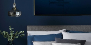
Pantone 2020 signature colour Classic Blue 19-4052, source: House Beautiful
Displaying a carefree confidence and a daring curiosity that animates our creative spirit, that is both inquisitive and intriguing, Very Peri stimulates creativity, helps us embrace this altered landscape of possibilities, opening us up to a new vision as we rewrite our lives.
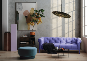
Pantone 2022 signature colour Very Peri 17-3938, source: Abode2
While Pantone’s palettes are relatively strong and are especially suitable for product designers or for using as accents, the range offered by paint companies is worth flipping through before starting the interior work. As counterbalance, the recent trend announcements by Sadolin and Tikkurila are delicate light blues that bring the summer sky and hope for the future into the interior. It is not surprising that all these tones speak of peacefully passing through the current turbulent times towards a bright future. Shades of blue are known to have a soothing psychological effect.
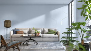
Sadolin 2022 signature colour Bright Skies T0.10.70, source: Sadolin
Sadolin’s colour for 2022 is the light and airy Bright Skies blue, which indeed feels like a breath of fresh air, refreshing, optimistic and vibrant – exactly what we need most this year. According to Sadolin, recent years have changed people and the role of the home; outdoors are valued more than before, great comfort and inspiration is found in creativity and art, and values have changed. In home interiors, Bright Skies have a welcome revitalising and expanding effect.
Sadolin 2022 signature colour Bright Skies T0.10.70, source: Sadolin
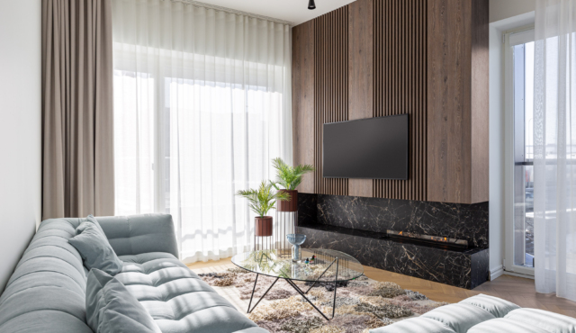
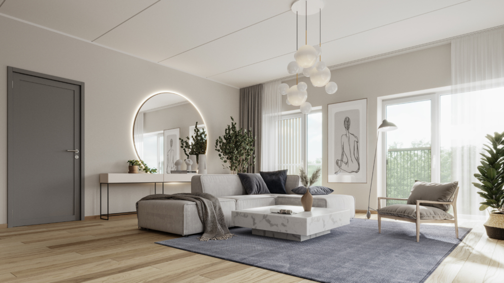
At first glance, the blue colour scheme may seem cold and bleak to Estonians, but the final look of a room is achieved in harmony between all the colours, and the trendy blues are accompanied not only by pastel pinks and greens, but also a warm spicy selection of golden browns, ochres and tawny shades. The entire lovely palette is actually very colourful and bold, taking us back in time and hinting at the crazy twenties, the rocking fifties, the mischievous seventies and much more.
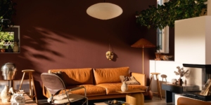
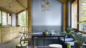
Tikkurila 2022 signature colour Kestrel L478, source: Tikkurila
As an expected twist in the plot, Tikkurila is offering an uplifting ripe and saturated reddish-brown called Kestrel for 2022, placed on a very agreeable tray of beautiful interior tones. According to Tikkurila, Kestrel has a certain intensity, but also softness and calmness, which feels like a hug. This calm and soothing brown brings intimacy, depth and a nest-like atmosphere to your home.
Fashionable colour palettes and interior painting ideas can be explored in more detail on the following pages: